Facet dropdown with React InstantSearch
This is the React InstantSearch v7 documentation. React InstantSearch v7 is the latest version of React InstantSearch and the stable version of React InstantSearch Hooks.
If you were using React InstantSearch v6, you can upgrade to v7.
If you were using React InstantSearch Hooks, you can still use the React InstantSearch v7 documentation, but you should check the upgrade guide for necessary changes.
If you want to keep using React InstantSearch v6, you can find the archived documentation.
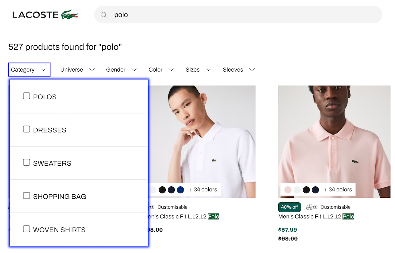
All Search and Discovery user interfaces display, in addition to a search box, a series of filters that allow end users to narrow down their search. As explained in the docs, these onscreen filters are called facets. A typical facet is an attribute like “brand” or “price”, and facet values are the individual brands and prices. By clicking on a facet value, users can include and exclude whole categories of products. For example, by selecting “Blue” in the “Color” facet filter, a user can exclude every product except blue ones.
For a long time, ecommerce websites have been displaying facets on the left side of the screen, allowing easy access. But this placement reduces the space available to display products. With the rise of mobile-first design and touchscreen, online businesses have started to display facets at the top of their product listing. That’s the case of Lacoste which has increased its sales by +150% sales from Algolia’s search.
Dropdown faceting offers two benefits:
- It increases facet visibility and accessibility, encouraging more usage.
- It simplifies the screen, leaving more room for products and creating more on-screen breathing space, an important UX design choice.
This guide shows how to turn a facet filter, commonly represented by a <RefinementList> or a <HierarchicalMenu> widget, into a dropdown layout.
Overview
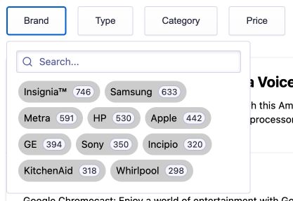
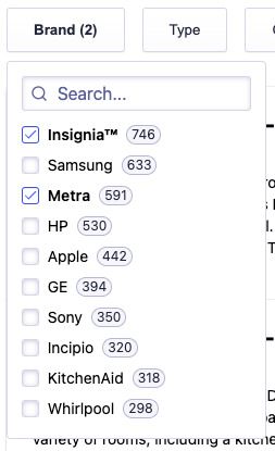
By design, each facet dropdown widget has two elements:
- A button with a label and the number of active refinements.
- A panel (that can be toggled) containing the widget.
Both can be customized.
The facet dropdown widget can only contain one widget and is compatible with <DynamicWidgets>
Quick start
1. Clone/fork the code sample
To get started, you can clone the code sample (and follow the instructions to install the dependencies) or fork the following CodeSandbox.
In the project, you will see two components:
Panel.tsxused as the dropdown that can be toggled. It also displays a header, wraps your provided widget and adds a footer on mobile.FacetDropdown.tsxused to get the number of active refinements for the provided widget and close the panel when the search state has changed.
If you want to use the facet dropdown widget in your own project, don’t forget to install/duplicate the dependencies for each widget (like the hooks folder and utils.ts file).
2. Use the facet dropdown widget
A basic usage of the facet dropdown widget:
1
2
3
<FacetDropdown>
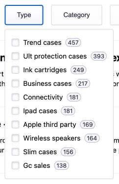
<RefinementList attribute="type" />
</FacetDropdown>
The <FacetDropdown> widget automatically retrieves the attribute of the first provided child widget to display the number of current refinements in the dropdown toggle button.
Props
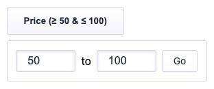
buttonText (String | Function - Optional)
You can use the buttonText prop to customize the text displayed in the dropdown button. It can be a string or a function. By default, it shows the number of active refinement for the provided widget.
Here’s an example showing how you can get the current refinements to display the current bounds of a <RangeInput> widget.
1
2
3
4
5
6
7
8
9
10
11
12
<FacetDropdown
  buttonText={({ refinements }) => {
    const [start, end] = refinements;
    return start || end
      ? `Price (${(start || end).label}${
          end ? ' & ' + end.label : ''
        })`
      : `Price`;
  }}
>
  <RangeInput attribute="price" />
</FacetDropdown>
closeOnChange (Boolean | Function - Optional)
You can use the closeOnChange prop to close the dropdown as soon as the user selects a facet value using a boolean or function that returns true.
If it’s false, the dropdown isn’t closed automatically, allowing the end user to select more than one facet value.
Here’s an example where the dropdown is automatically closed only if the end user is using a device with a width greater than or equal to 375px.
1
2
3
4
5
6
7
8
9
const MOBILE_WIDTH = 375;
/* ... */
<FacetDropdown closeOnChange={() => window.innerWidth >= MOBILE_WIDTH}>
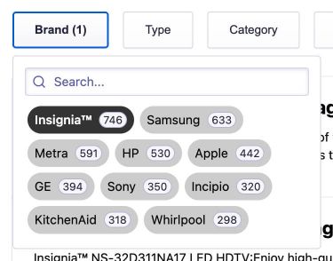
<RefinementList
attribute="brand"
searchable={true}
searchablePlaceholder="Search..."
/>
</FacetDropdown>
cssClasses (Object - Optional)
You can use the classNames prop to add CSS classes on multiple elements of the facet dropdown widget.
Here’s an example that adds custom CSS classes.
1
2
3
4
5
6
7
8
9
10
<FacetDropdown
  classNames={{
    button: 'MyButton',
    buttonRefined: 'MyButton--refined',
    closeButton: 'MyCloseButton',
    mobileTitle: 'MyMobileTitle',
  }}
>
  <RefinementList attribute="type" />
</FacetDropdown>
Customizing the UI
The generated markup allows you to customize the look and feel to your needs, to change the default aspect of the dropdown with a few lines of CSS. Here’s the default version:
There are two aspects you can customize to your needs:
-
Inline facet values
The brand dropdown widget of the demo uses an inline list. Code is available in the
App.cssfile.
Here’s the CSS:
1
2
3
4
5
   .my-BrandDropdown .ais-RefinementList-list {
     width: 20rem;
     display: flex;
     flex-wrap: wrap;
   }
-
Fixed height dropdown
The category dropdown widget of the demo, which is hierarchical, uses a fixed height list. Code is available in the
App.cssfile.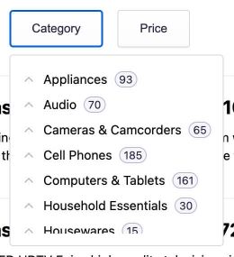
Here’s the CSS:
Copy1 2 3 4
.my-CategoryDropdown .ais-HierarchicalMenu { height: 185px; overflow: auto; }
Providing mobile support
Mobile devices are already supported by the widget. Below 375px (this breaking point can be changed, see below):
- the dropdown position is fixed and taking the full page size.
- the page scroll is locked when the dropdown is open.
- the button text is added as a title at the top of the dropdown.
- a button to apply the changes is added at the bottom of the dropdown.
If you want to customize the default behavior, the facet dropdown widget uses the following CSS media query:
1
2
3
@media only screen and (max-width: 375px) {
  /* ... */
}
It also uses the following logic to prevent page scrolling when the dropdown is open:
1
2
const isMobile = useMediaQuery('(max-width: 375px)');
useLockedBody(isOpened && isMobile);
This code sample gets you started by providing a basic look and feel for mobile devices. You might want to refactor the provided code to match your current design and thus offer the best experience to your mobile users.
