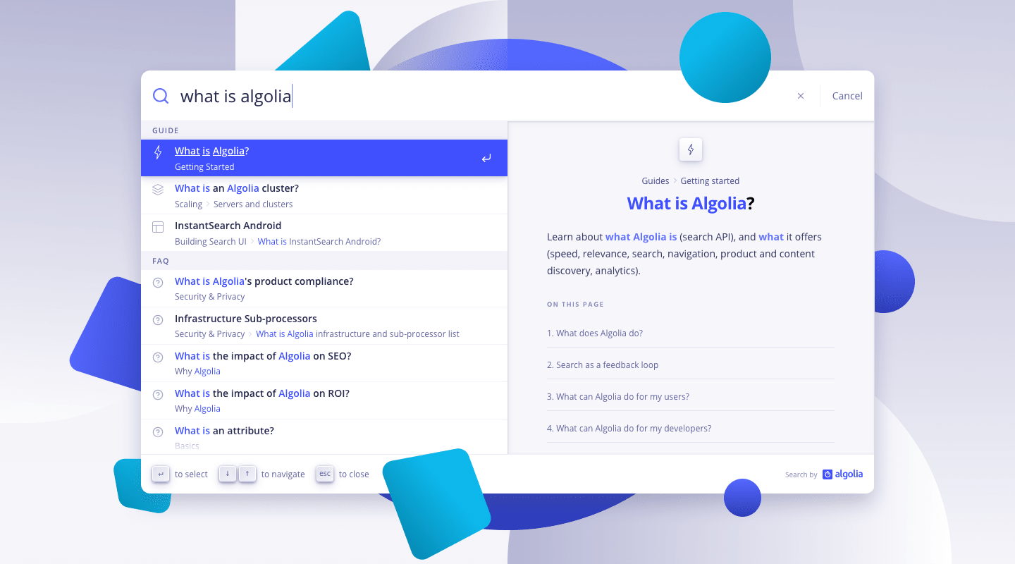
When is a search bar not a search bar? When it’s an “omnibar” built with Autocomplete!
In her episode of Learn with Jason, Sarah Dayan mentioned the idea of using Autocomplete to create an experience brimming with shortcuts and power-user affordances.
In this tutorial, we’ll walk through setting up Autocomplete to fire interactions with JavaScript. Specifically, we’ll build an omnibar to toggle light and dark mode for our website. An omnibar is a search field that has both search and actions that can be taken. A strong example of this is the Chrome or Firefox search and URL bar.
In the search field, a user will be able to type in / commands. These commands will be tied to specific JavaScript methods to trigger. We’ll also make the Autocomplete results stateful. When the app is in light mode, the light mode option will show an “enabled” flag. When dark mode is enabled, the dark mode option will show the flag.
At its core, Autocomplete is a vanilla JavaScript library. Let’s make it a bit more reusable by mounting it as a React component for use in any React-based framework or site.
We’ll start with CodeSandbox’s basic React sandbox. Fork this sandbox to get the exact starting point with all packages installed for us.
To create our component, we’ll start by adding a new file named Autocomplete.js. This file will house all the initialization code for the Autocomplete library and export the component for use in our application.
At the top of the new file, import the necessary elements from React, React-dom, and the Autocomplete libraries.
import React, { createElement, Fragment, useEffect, useRef } from "react";
import { render } from "react-dom";
import { autocomplete } from "@algolia/autocomplete-js";
Once imported, we need to export a new functional React component. We’ll start with the basic boilerplate for creating a new mounted component.
export function Autocomplete(props) {
  const containerRef = useRef(null);

  useEffect(() => {
    if (!containerRef.current) {
      return undefined;
    }

    // Space to initialize autocomplete on the newly created container

    // Destroy the search instance in cleanup
    return () => {
      search.destroy();
    };

  }, [props]);

  return /<div ref={containerRef} //>;
}
This code will take care of the basic initialization and breakdown of the component on mount and unmount.
Inside the function, it’s time to initialize the Autocomplete instance.
// Creates an Autcomplete component from the JS library
// https://www.algolia.com/doc/ui-libraries/autocomplete/guides/using-react/
export function Autocomplete(props) {
  const containerRef = useRef(null);

  useEffect(() => {
    if (!containerRef.current) {
      return undefined;
    }

    // Initialize autocomplete on the newly created container
    const search = autocomplete({
      container: containerRef.current,
      renderer: { createElement, Fragment },
      // Autocomplete render()
      // https://www.algolia.com/doc/ui-libraries/autocomplete/api-reference/autocomplete-js/autocomplete/#param-render
      render({ children }, root) {
        // react-dom render
        // https://reactjs.org/docs/react-dom.html#render
        render(children, root);
      },
      ...props
    });

    // Destroy the search instance in cleanup
    return () => {
      search.destroy();
    };
  }, [props]);

  return <div ref={containerRef} />;
}
The autocomplete method accepts an object of options. We set the container property to be the element created by this function. By specifying the renderer function, we can use React’s createElement method and Fragment component.
Then, we need to provide Autocomplete with a render function. This function will accept an object of components to render (children), and the element to attach the instance (root).
We can then use any method to render these items. In our case, we’ll use react-dom‘s render() method and pass it those same elements. Finally, we want to pass the autocomplete method any additional props added to our component when we use it. This will allow for on-the-fly customizations.
Using the <Autocomplete /> component
Moving to the App.js file, we can import our Autocomplete component (along with some default styling).
// Styles
import "./styles.css";
import "@algolia/autocomplete-theme-classic";

// Import algolia and autocomplete needs
import { Autocomplete } from "./Autocomplete";
From here, we’re ready to put an Autocomplete field on the page. Inside the App() function’s JSX return value, we can put the <Autocomplete />component anywhere that makes sense for the UI. I suggest right after the main text of the page.
export default function App() {
    return (
      <div className="App">
           <h1 className="text-xl">
             Run JS from{" "}
             <a href="https://www.algolia.com/doc/ui-libraries/autocomplete/api-reference/autocomplete-js/autocomplete/">
               Autocomplete
             </a>
           </h1>
           <p className="text-base">
             This demo is based on the amazing idea of{" "}
             <a href="https://twitter.com/frontstuff_io">Sarah Dayan</a> in her
             appearance on{" "}
             <a href="https://www.learnwithjason.dev/javascript-autocomplete">
               Learn with Jason
             </a>
             .
           </p>
           <p>
             Use the Autocomplete box below to toggle dark mode and perform other
             JS-driven actions on the page.
           </p>

            <Autocomplete />

      {/* ... the rest of the function ... */}
      </div>
    )
  }
The Autocomplete component can accept any prop that the autocomplete-js library can accept as an option. To start, let’s add placeholder text.
<Autocomplete placeholder="Try /dark" />
A search field should appear in our app with the placeholder text set. This field doesn’t do anything yet. Let’s add some data to complete.
Adding an actions source to the Autocomplete component
The Autocomplete library is capable of creating autocomplete functionality against multiple sources. In our case, we’ll only have one static source, but any external data – including Algolia indices – can be used to populate this functionality.
To add a source, we’ll use the getSources prop and provide a function that accepts the query option. This query is what a user is actively typing into the input. We can use this to check against the items in our data.
A source is an object in the getSources returned array. The basic elements we need for the source are a sourceId string, a template object for rendering, and a getItems() function that returns the data. For now, we’ll just return a static array with a label attribute. This is enough to populate our autocomplete. Let’s also add openOnFocus as a prop to automatically list our items when a user focuses the field.
Now, we have items populating our field, but we’re not filtering items as we type. Let’s fix that with a couple helper functions.
Filtering and highlighting Autocomplete items
When using an Algolia index, we can use some helper functions to manage filtering and highlighting, but we’re not using an Algolia index. In our use case, we want to keep this fully in the browser. To do this, we need a couple helper functions to properly filter and highlight our options.
Filtering Autocomplete items with JavaScript RegExp()
JavaScript offers the ability to filter an array based on a regular expression test. To do that, we need to create a pattern to test against for any combination the user can throw at us. Let’s create a helper function based on the query and use that in a JS .filter() method.
In App.js outside the export, we’ll create the new helper function getQueryPattern().
function getQueryPattern(query, flags = \"i\") {
  const pattern = new RegExp(
    `(${query
      .trim() // Trim leading and ending whitespace
      .toLowerCase() // convert to lower case
      .split(" ") // Split on spaces for multiple commands
      .map((token) => `^${token}`) // Map over the resulting array and create Regex_
      .join("|")})`, // Join those expressions with an OR |
    flags
  );

  return pattern;
}

export default function App() { /* ... */ }
Once the helper function is created, we’ll create the pattern in the getItems() method before we return the array of items.
With the pattern saved, we can test our array against it.
Now, when we type /dark into the field, only the /dark option. We haven’t given the user any indication of why that works. Let’s add a small highlighting function to showcase the letters typed.
Highlighting the string being typed in results
In order to highlight the typed text, we need to take the query text and the pattern we created in the last step and generate a new string that adds additional markdown around the typed text.
Right after the getQueryPattern helper function, let’s create a new highlight helper function.
function highlight(text, pattern) {

    // Split the text based on the pattern
    const tokens = text.split(pattern);

    // Map over the split text and test against the pattern
    return tokens.map((token) => {

      // If the pattern matches the text, wrap the text in <mark>
      if (!pattern.test("") && pattern.test(token)) {
        return <mark>{token}</mark>;
      }

      // return the token back to the array
      return token;
    });
  }
This helper function takes the text to test and the pattern to check it against and returns a string with additional markup.
We start by splitting the text based on the pattern. This will give us an array with two parts – matched and unmatched. As we map over this new array, we can check the text against the pattern and if it matches, wrap that specific item in a new piece of markup. If it doesn’t, return the unmodified text.
With that helper function, we can now map over all the filtered items. We’ll take the action item and return back an object with all of its initial properties, but a new highlighted property that contains our highlighted text. This is built from the action’s label property and the pattern we defined earlier.
Now instead of using the action.label in our template, we’ll change it to use the new highlight property. When /dark is typed into the field, the item will have properly highlighted text.
The filtering UI is complete, but when we select an item, nothing happens. Let’s fix that.
Firing a JavaScript function in Autocomplete with onSelect
Each source in the getSources array can have its own onSelect method. This method defines the functionality for when a user selects an option – via keyboard or click.
Let’s start by making a global select function to log the item’s data and then reset the query to a blank string.
getSources = {({ query }) => [
    {
      sourceId: "actions",
      templates: {
        item({ item }) {
          return <h3>{item.highlighted}</h3>
        }
      },
      // Run this code when item is selected
     onSelect(params) {
        // item is the full item data
        // setQuery is a hook to set the query state
        const { item, setQuery } = params;
        console.log(item)
        setQuery("");
      },
    }
For one action, we could define the JavaScript in this method, but to make this reusable for any action in the future, let’s define the method on the item’s data instead.
To do this, we’ll define a method named onSelect for each item. This method can handle whatever functionality you need. In this case, we’ll create a very simple dark and light mode by adding the class dark to the body to enable dark mode and remove it to enable light mode.
Now, back in the main onSelect method, instead of running console.log(item), we can run item.onSelect(). This will fire the functions we just created.
We now have functioning actions!
Enhancing the omnibar experience
With working actions, we can focus a bit on crafting a strong user experience for our omnibar.
Automatic highlight and select
First, let’s have Autocomplete automatically highlight the first item in the list. This will allow a user to select an action by just hitting enter.
To add this feature, we need to pass a new prop to the <Autocomplete />component. By passing the prop defaultActiveItemId a value of "0", we can have the first item in the list be active. Any active item can be selected by hitting enter. This makes for a solid keyboard experience.
Creating a more robust UI with a new component
Let’s abstract the template to use a separate component called Action. We can build this in a separate file or create it in App.js.
To use the component, we’ll pass it a hit prop that will contain our item data. This component will also use specific class names that match specific items in the classic theme we imported at the beginning of the tutorial.
Inside the markup, we provide the highlighted text and two new items: hit.icon and an SVG representation of the return key. This adds some customized iconography
This is starting to look really nice. It’s a bit odd that the site is in light mode, but the light mode option provides no indication of that. Let’s add some context for our users.
Creating an enabled state with setContext
Autocomplete gives us access to state. Let’s use that to create an enabledstate and set that state when our actions are fired.
Let’s start by adding a new property to each action named enabled.
This property will check the Autocomplete’s state object for a context item labeled dark. If dark is set to true, the dark action will have a true enabledstate, if false, light will be true.
To have that context, we need to set the context of the app during our onSelect functions. We can pass the setContext method into our onSelectfunctions and use that to set dark to true or false.
We need to pass the setContext method in the options object for our sources method. Start by changing getSources={({ query })} to getSources={({ query, setContext })}. Then we can use setContext in our onSelect functions.
And with that, our omnibar is stateful. This is a relatively simple example of dark mode. To build it out more, you could add and set the context of the omnibar from the overall state of your application or based on information in a user’s localStorage.
Next steps
In this tutorial, we built out Autocomplete to be more than search, but you can also add regular search functionality with a different source object with its own set of templates. You can also extend the actions to match any potential actions your application has.


 Algolia Recommend